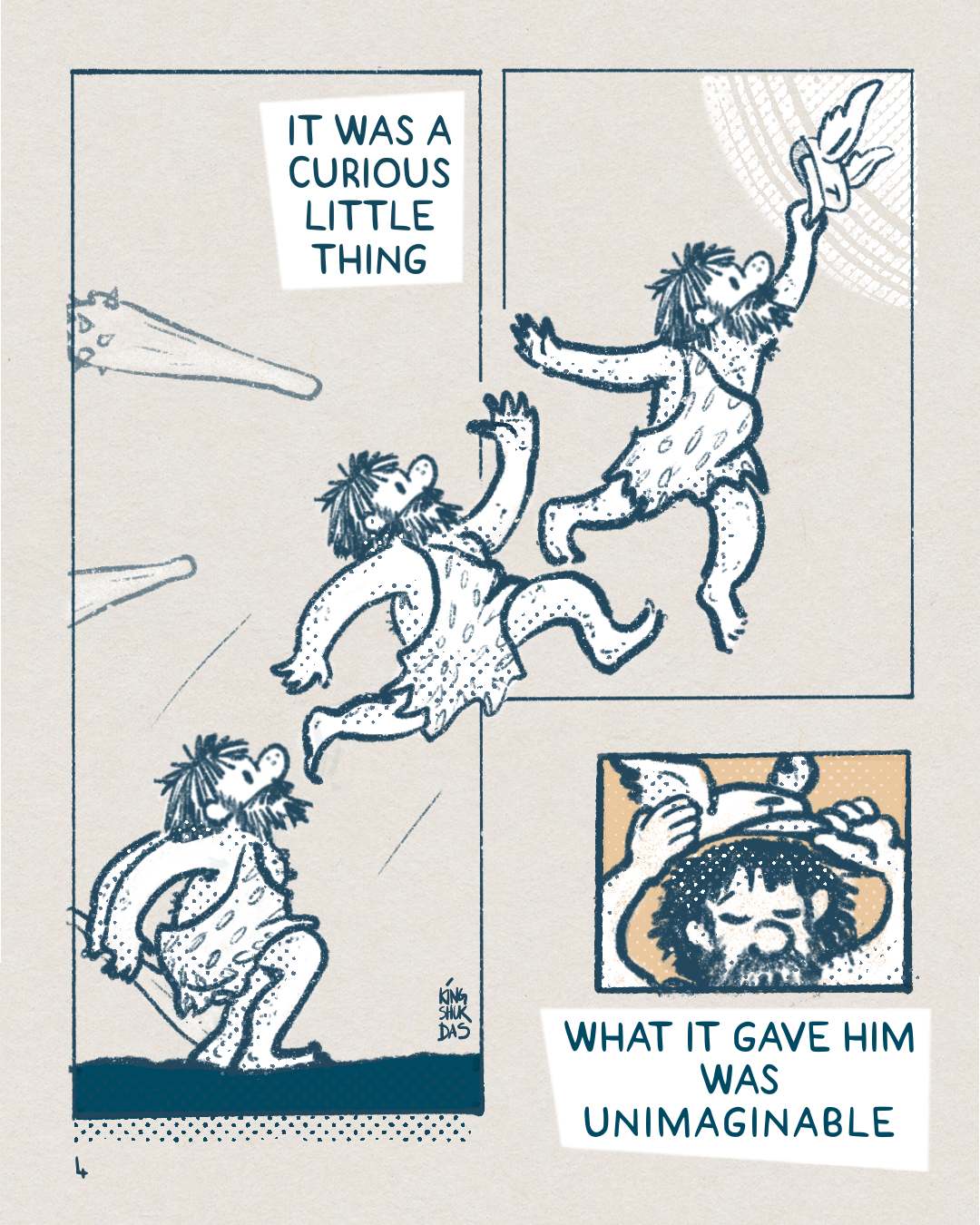
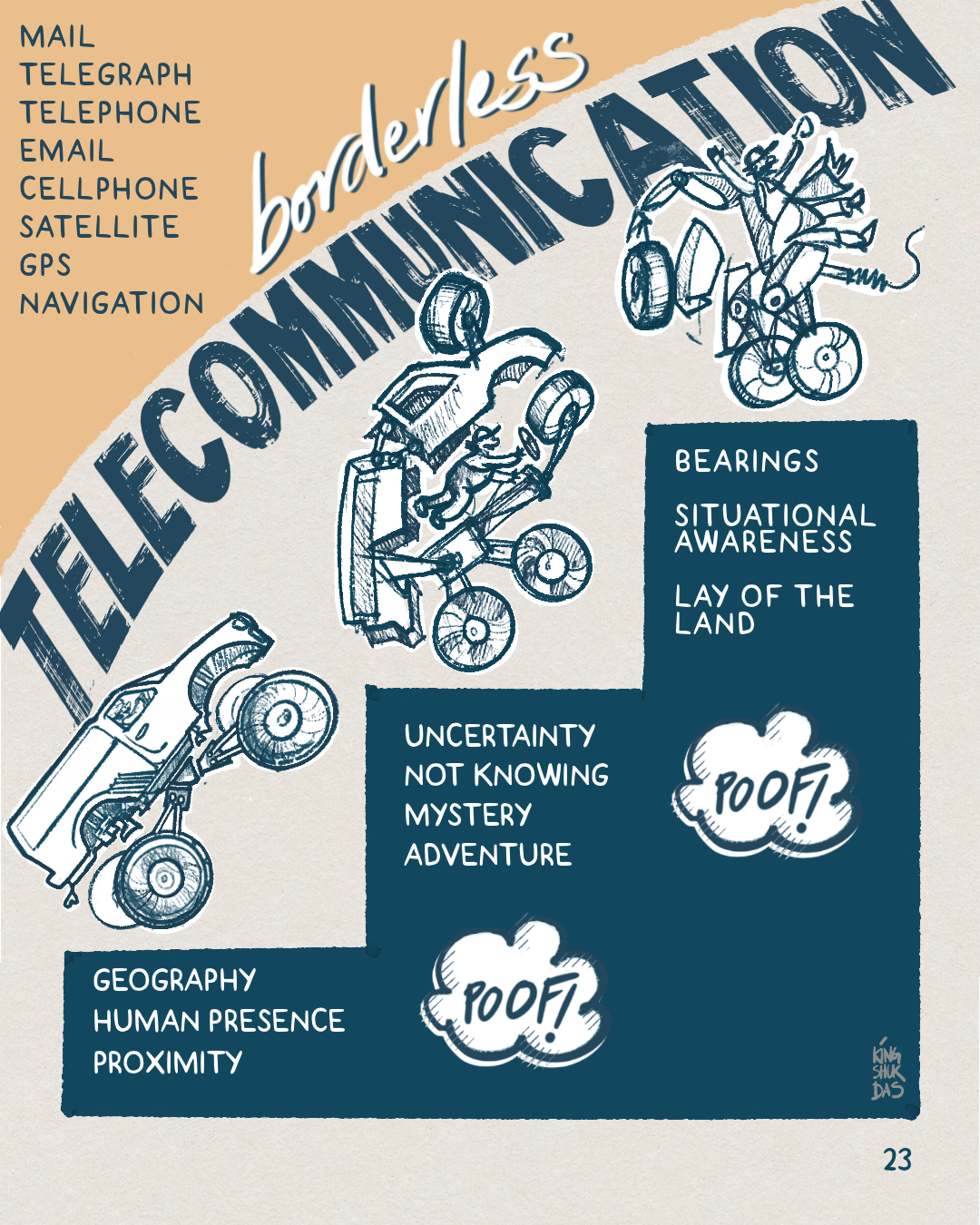
Marlo Levels Up

A Webcomic About Technology & AI

Best viewed on tablet-sized screens, or larger phones.


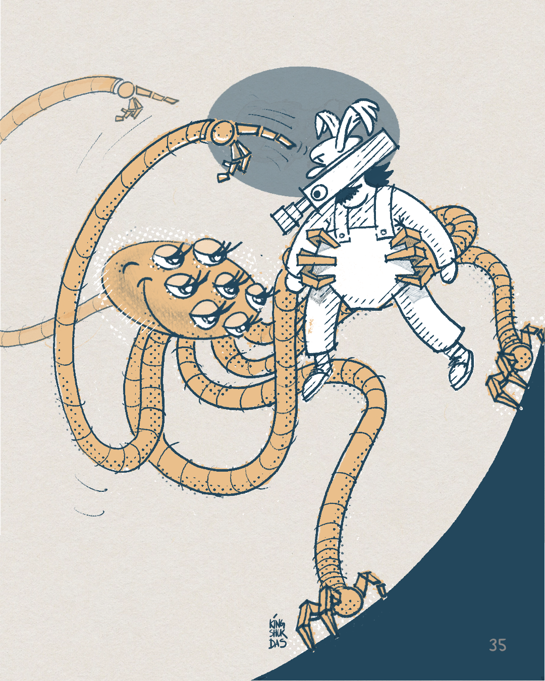
Cover of Marlo levels Up - webcomic about technology & AI created by Kingshuk Das. Version 1.0

© 2023 by Kingshuk Das is licensed under Attribution-NonCommercial-NoDerivatives 4.0 International


MAY 6th, 2023

If you're keeping up with developments in generative AI, you know that the algorithm essentially "hallucinates" its output -- remixing everything it's been fed in random ways -- which we can then tweak to get to something closer to the truth.

Well, we humans can play that game as well :)

Hallucinate, remix, adjust.

This is V1.0 of one such hallucination.

I have always loved comics as a storytelling medium, but I’ve never made one. So this is a debut of sorts.

Backstory, if you’re interested:

We've been playing a long game with technology — every technology we have ever invented.

It started with our first bit of meta magic: the ability to remix concepts & build on them in our minds, and try out new things in the world -- instead of just reacting to external forces. It's the language-based feedback loop of innovation that changed our brains -- from observations to mental models to hypotheses to prototypes…

At each step, the game asked us to make a trade: We got to reduce some of our labor, time, pain, & the unpredictability in our lives, and outsource it to technology. In turn, we gave up things that seemed unimportant, but in hindsight turned out to be ineffable traits that add up to make us the amazing, free-thinking social animals that we are.

That's the way it's always worked, and we've always innovated our way through it.

But this time, with Artificial Intelligence, it feels a bit different.

It feels like we've come full circle. Thinking, writing, reading, talking -- we're giving away the crown jewels. They are hard. It's easier to consume than to think and create. We can offload them to make life easier, or to help us do more. We've always used tech to take the pain away.

But we have to ask -- what if the hard things are (at least partly) what give our lives meaning? How much of the baby are we throwing out with the bathwater?

The smartest people in the world are split on whether to hit the gas or the brakes. I’m agnostic about AI doom or boom prognostications, and mostly interested in how we steer it towards outcomes that make us more creative, and more human, rather than less.

...

There's much more to that, of course.

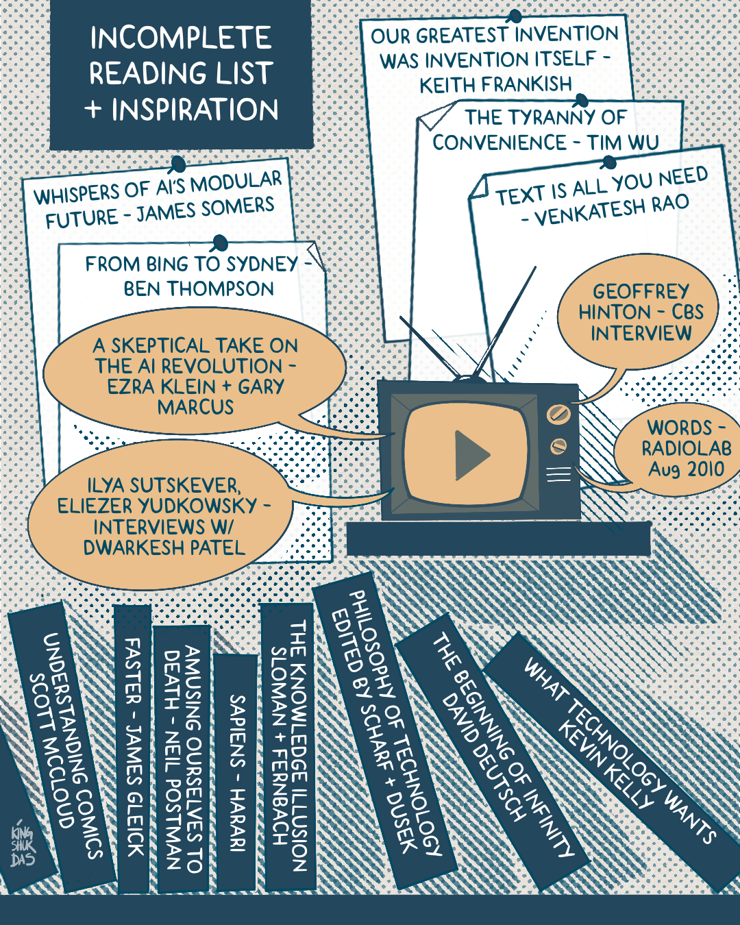
For now, check out some of the related listening/reading, in case you missed any of these👇


Related Links:

PODCAST/VIDEO EPISODES

Words
Radiolab August 9, 2010
— this will change the way you think about what language does to our brains

A Skeptical Take on the AI Revolution
Ezra Klein + Gary Marcus

Eliezer Yudkowsky interview
&
Ilya Sutskever interview
Dwarkesh Patel (Lunar Society)

Geoffrey Hinton interview


ARTICLES/BLOG POSTS

Our greatest invention was the invention of invention itself
Keith Frankish

Whispers of AI’s Modular Future
James Somers

From Bing to Sydney
Ben Thompson

Text is All You Need
Venkatesh Rao

The Tyranny of Convenience
Tim Wu

The Imminent Danger of A.I. Is One We’re Not Talking About
&
This Changes Everything
Ezra Klein

BOOKS:

What Technology Wants
Kevin Kelly

The Beginning of Infinity
David Deutsch

Philosophy of Technology (Anthology)
Edited by Scharff + Dusek

Sapiens
Yuval Noah Harari

The Knowledge Illusion
Sloman + Fernbach

Understanding Comics
Scott McCloud


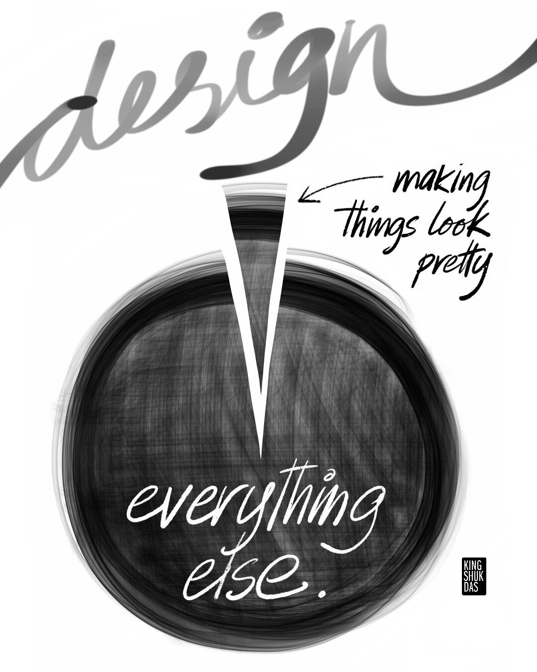
Art and Design bring a Different Kind of Rigor to Business-as-usual
Popular myths equate creativity with playful chaos & eureka moments. But professional creatives know that coming up with fresh insights in the face of everyday challenges requires a specific kind of discipline — in mindset & methodology.

In real art & design (vs. the decoration industry) there’s painstaking work needed to look deeper & differently at the world around us, notice different things, and reimagine the old in new ways.

The best artists & entrepreneurs share this approach, in a way. The result in both cases are new directions that are invisible to folks using purely quant, linear, or bureaucratic approaches, or relying purely on conventional wisdom.

It’s this rigor that’s your secret weapon in situations where traditional business & engineering methods fall short, and it’s particularly suited to business challenges involving innovation. 

A few examples:

  1. Creating new business ideas that you couldn’t come up with by just looking at the numbers

  2. You don’t know the “right” answer in advance, and it’s not a multiple-choice test (you need rapid hypothesis generation & testing)

  3. Trying to create new markets that don’t exist yet (so the data doesn’t exist either)

  4. Going from a one-hit-wonder to broader, more repeatable innovation systems

  5. Connecting dots that are not visible at the surface — unique value hiding in the ordinary & everyday

  6. You have to understand people/customers differently - reframe markets & domains from a human standpoint, not your corporate orthodoxies

  7. Unleash true cognitive diversity to solve complex challenges — different thinking & problem-solving styles, not just demographics

  8. When becoming “part of the culture” is critical to the success of business & tech ideas (think Apple, Tesla, AirBnB…)

  9. But it takes special skills, training, & experience to adapt & apply creative tools to “non-traditional” challenges that may not look “creative” on the surface.

More examples here.


< BACK TO NOTEBOOK

Kingshuk Dasdesign
Simplify.

When I saw Rothko’s early work for the first time, it was a bit of a surprise.

Knowing nothing about him, I had always imagined him as this calm, sage-like figure, much like his iconic paintings. I had marveled at the minimalism and self-restraint of his visual language.

His early work is anything but.

A few different lightbulbs went off as I leafed through the paintings, but the most obvious one got stuck in my head and stayed there all day. Simplicity and minimalism make more sense at the end of a process rather than as a convenient starting point. Energy, emotion and content need to soak over time and over countless iterations before their minimal expression can get imbued with magic. Minimalism, in art, design, or culture — that springs fully formed out of a vacuum without the benefit of life experience—is fake, skin-deep, and kind of pointless.

Here’s a quick attempt at visualizing Rothko’s artistic journey:

1*B_NsSW-QtqIEUS8n4mpSlw.png

Update:
Extending the timeline in both directions only accentuated the distance, in my mind, that Rothko had to travel to become Rothko.

1*GgPxYY1Dh2ItbSQKeK9Ppg.png

“We favor the simple expression of the complex thought.”

From the National Gallery of Art:

In their manifesto in the New York Times Rothko and Gottlieb had written: “We favor the simple expression of the complex thought. We are for the large shape because it has the impact of the unequivocal. We wish to reassert the picture plane. We are for flat forms because they destroy illusion and reveal truth.” By 1947 Rothko had virtually eliminated all elements of surrealism or mythic imagery from his works, and nonobjective compositions of indeterminate shapes emerged.

That last piece in monochrome is sad. It was reportedly painted just a few days before his suicide in 1969.

On a brighter note, here’s a painting from his so-called Seagram Murals, originally commissioned in the 1950s for The Four Seasons Restaurant in the Seagram Building on Park Avenue, New York. The artist was uneasy about the commission, reportedly saying:

“I hope to paint something that will ruin the appetite of every s** of a b**** who ever eats in that room.”

Kingshuk Das
Octagon on a Stick

With the country split in two, here’s a quick reminder of an odd thing, designed right here in America, that helps us cooperate with complete strangers, in a split second, without even talking.

As an immigrant, it’s easy to notice random little things in culture that have become invisible to locals. As a designer, it’s also my job to do so. Driving on our daily commutes, most Americans will not think twice about a unique example of American civility that we take for granted in our everyday lives.

1*25qkF0Zsr7wOaIIXSje4ow.png

It’s a humble traffic sign that represents the best of America.

Consider the social behaviors enabled by this 2'X2' entropy fighting, civilization enhancing, chaos containment octagon-on-a-stick.

Four cars — a Prius, a monster truck, a beat-up Chevy Cavalier, and a BMW, pull up to four-way stop in Anywhere, USA, from four directions, at the same time.

They are strangers to each other, from different walks of life, education levels, and political convictions.

Here’s a slow-motion breakdown of what usually happens next:

  1. They see a red & white octagon planted in the ground, and they all stop. No policemen around, no cameras, no witnesses. The briefest of eye contact is exchanged among the four, if any.

  2. Our protagonists have a million things on their minds at that moment. Yet in a split-second they negotiate & decide who arrived first. In this case let’s say they decide it was Chevy.

  3. Somehow, Chevy correctly arrives at the same conclusion herself, owns the decision, and lurches forward — at risk of being simultaneously crushed from three directions if the others flout the rules.

  4. They then decide that Prius arrived second, so Prius leaves next. Then Truck, then BMW last. All this without anyone leaving their vehicle, without honking, histrionics or even a single word exchanged.

  5. The process repeats itself silently, millions of times every day, in millions of intersections across the length & breadth of the United States. It’s a beautiful thing.

Image source

Image source

For its time, the four-way stop was a brilliant work of design.

I first saw one in action for the first time when I moved to the US in my mid-twenties. I had grown up in India. There are many amazing things that the world can learn from my country of birth. But the habit of following rules in public spaces is not one of them.

It would be clear the first time you try to board a bus, a plane, or expect to wait in an orderly line for any other service. A queue is a mini riot. A traffic light is a mere suggestion. Turn signals are decorations. And lane markings outright jokes. It makes traffic in Manhattan feel like a Red Square parade.

1*LfEgvnZ5Z6FV5Zsxy-SnSQ.png

The usual romantic narratives around America are about freedom and individualism. Which are awesome things. Many immigrants are indeed fleeing places lacking in freedom— places with authoritarian, repressive regimes that try to control every aspect of public life.

But some of us have actually moved here from places that can feel quite the opposite — where the lack of rules & accountability can actually lead to a perception of greater individual freedom in daily life. Places where government infrastructure and institutions are so dysfunctional that it’s all up to individuals (and their family/community networks) to succeed or fail, by hook or by crook. Where laws can be bent or broken if you have money, power, or connections. Where most social improvements are driven by private investment or charity. Where at best it’s about survival of the fittest, at worst, the law of the jungle. Weirdly enough, these places are in many ways a libertarian’s ideal of individual freedom made real, and untethered.

A working four-way stop, in a place like that, would be an impossibility.

By now, I’m sure many of you are thinking of the dozens of reasons STOP signs suck, and all the arguments for improving or replacing them. That’s not the point. The question is, what’s made them work as well as they have, for over a hundred years?

Image: Stop sign in Ruby Valley, Nevada;&nbsp;Famartin, Wikimedia Commons

Image: Stop sign in Ruby Valley, Nevada; Famartin, Wikimedia Commons

What can the STOP sign tell us — about ourselves and how we might co-exist in the future?

Image: Stop sign in Ruby Valley, Nevada; Famartin, Wikimedia Commons

A crude attempt at articulating the obvious, hiding in plain sight:

  1. The STOP sign is egalitarian without being overly restrictive. For a moment in our deeply uneven society, it equalizes, erases entitlement and neutralizes privilege. It doesn’t matter what you look like, how much money you make, or who you know. Every one slows down & stops for the other.

  2. It provides constructive, just-enough structure. First-in, first-out. A simple rule that sets us free. A cooperation-unlocker that we can use to self-regulate & self-organize without the need for further technology or authority figures.

  3. It’s based on simple, shared trust. Common decency every day. The whole thing would fall apart if you couldn’t trust strangers to follow the rules. If might was always right. If everyone felt compelled to take advantage of the system at every turn. If self-interest (or family, or religion, or in-group) was the only thing.


That last bit is proprietary, America.

It’s our IP. You can replicate the form, but not what makes it work. The integrity of the United States is based on a mindset — a delicate one that’s always teetering on the edge of being thrown out of balance.

What sets us apart is not just freedom. It’s the ability of strangers to trust and actively work with each other based on a shared code of conduct.

That’s not an app. No fancy technology, AI, VR, or venture capital is needed for it. Heck, it doesn’t even use the electrical grid. It’s invisible, intangible. It slips through your fingers if you try to grasp it.

The net result is a culture that’s co-created and co-maintained.

Fragile magic that takes decades to build, but just days to undo.


Image&nbsp;source

Image source

Kingshuk Das
Strategy vs. Design Thinking

Underthinking is just as bad as Overthinking

**[“Vs.” is an artificial dichotomy used only as a rhetorical device in this post :)]

Kingshuk Das Build Think.png

Edited from my original piece in the Fall 2014 edition of Rotman Management Magazine, published by the University of Toronto’s Rotman School of Management

—————————————————————————————

Organizations looking to grow often find themselves caught between conventional and newer approaches to innovation. While traditional strategy calls for rigorous analysis and critical thinking, design thinking espouses 'thinking by doing'. The key is to find the sweet spot between the two approaches.

Death By Analysis

One of the worst habits associated with traditional strategy, especially in large corporations, is overthinking  - aka 'death by analysis'. An obsession with minimizing risk leads to the inability to make decisions fast enough to respond to disruptions. In strategy work, this shows up in fruitless attempts to quantify the unquantifiable and to predict the unpredictable.

In many ways, design thinking is intended as an antidote to death by analysis. With its bias towards making, iterating and real-world learning, it often succeeds in unlocking innovation. The payoff of this approach lies in the excitement of doing things we haven't tried before, and the emotional high that comes from breaking out of a deliberative state to take action. The first experience of design thinking thus feels energizing and liberating to organizations used to bureaucratic processes. However, applied indiscriminately, design thinking can cause a swing to the other extreme - underthinking.

Underthinking.png

Underthinking often shows up when innovation groups abruptly switch from a traditional processes to design thinking, hoping for 'quick hits' to impress the bosses. All-too-often, the long-term return on investments in design thinking falls well short of expectations. A new idea that seemed exciting at first or an impressive customer experience might turn out to be an inadequate revenue stream, too costly to implement, or too small to save a company faced with massive business model or structural challenges. This is what can happen when your thinking targets the surface symptoms of organizational ennui, missing the underlying malady.

Capability - the realm of what you can do - is not the problem; the question is, of all the things you can do, which ones should you do? For example, of all the mobile, cloud, retail, data and service experiences you can create for your customers and partners, which ones should you create? The overload of choices is not limited to consumers alone: decision-makers inside organizations are feeling it, too.

Strategy &amp; Design, at their best, are both about making better choices

Strategy & Design, at their best, are both about making better choices

What we need is not just action, but strategic action. Instead of knee-jerk responses to markets changes or consumer feedback, we need the patience, clarity and self-belief to make hard choices about what we are - and what we are not - about. No amount of design thinking will save you if you lack the stomach to make these tough decisions.

Take the classic rule of brainstorming - which also applies to design thinking: defer judgment. There is a time and place for deferring judgment, and that time and place is when we need to expand the possibilities available to us. The rule offers much needed relief in early-stage innovation, but it often becomes an excuse to avoid critical thinking later on in the process of creating new business models. When the need is to make hard choices and trade-offs, it's time to bring judgment back into the picture.

To find a better balance between overthinking and underthinking, we need to apply best parts of design thinking to the strategic discipline of considering alternatives, trade-offs and opportunity costs. The question is not whether to think or build: the question is when to build, when to think, and the how of either. And the answer lies in understanding where we are on the journey of creating new opportunities.

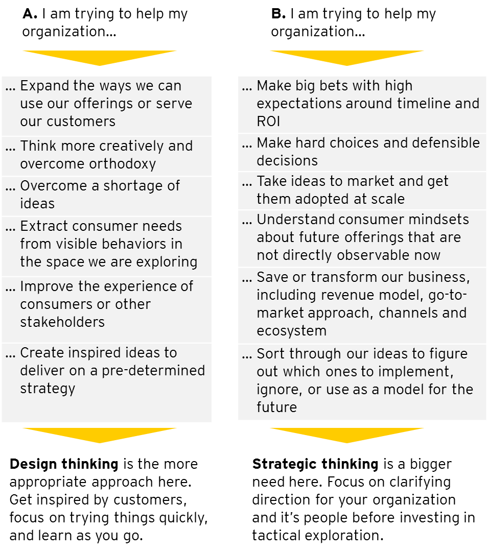
If you're a leader trying to help your organization thrive through uncertain times, use the following chart for some clues on whether to navigate through prototyping or through strategy.

Figure One

Figure One

The two scenarios in Figure One are stretched apart to underscore their philosophical differences in a simplified way. These are not just different processes: they represent different thinking styles and different cultures, and folks in an organization have varying degrees of training and aptitude for one or the other. As such, the dichotomy reflects the day-to-day friction between practitioners on both sides. While we are rarely presented with such clear options in practice, the onus is still on us to find the right balance between these two approaches.

Balancing the two approaches is not simply about mashing them up. Collage is a fun art form, but it's hardly a good strategy. When leaders try to speak to both sides of the aisle, they often send mixed messages that confuse the organization. The trick is to apply the strengths of design thinking to those of strategy in specific ways.


Following are five principles that will help strategy and design thinking influence each other in productive ways, enabling innovation practitioners to avoid the extremes of overthinking and underthinking.

1. The offering is not the strategy.

1*oqG6L_XizqiSv43dVCiNJQ.png

Iterative prototyping is a key aspect of design thinking - it's called 'build to think'. But organizations should prototype the strategy part of their new business direction, not just the product or service that is a manifestation of that direction. Traditional designers experiment only on offerings, and the experiments only tell us if that particular offering worked or didn't; it doesn't tell us whether the thinking behind the offering was sound or unsound. As a result, too many organizations throw out the baby with the bathwater: when an idea fails, the whole direction is scrapped and the organization loses its memory of why the direction is not being pursued any more. Instead, design experiments that reveal new ways to think about your industry, organization and offerings. These thought experiments can then act as prototypes of new mental models, including insights, assumptions, hypotheses and frameworks.

2. Make Thinking Tangible.

Find ways to bring strategic thinking to life beyond PowerPoint and Excel. Try different modes of expression - visual, verbal and kinesthetic. Some people need to see visual relationships diagramed out, some like to construct arguments, and yet others need to walk through the steps by role-playing a strategic scenario. No one method is better than the others; it's more about choosing the mode that helps you stretch your thinking and communicate more effectively with others. The key is to go beyond traditional quantitative approaches to try qualitative ones. You'll be surprised by how many CEOs can be swayed by an exceptional emotional argument as opposed to an average numerical one.

3. Diagnose Underlying Mental Models.

1*2a7BWtFRHMH1UnQjoOMwdg.png

Too often, designers and strategists impose their own mental models onto customers and business partners. It takes deliberate attention and specific tools to first become aware of the underlying assumptions being made on both sides, and then act upon them. To understand customers' mental models, you have to go beyond quantified data and observational research of visible experiences to analyzing people's stories, language and activities. This enables you to go beyond usability improvements and demographic segmentation towards psychographic, attitudinal profiles. These richer profiles are useful not just for messaging, branding and product/service design, they drive the strategic directions and go-to-market approaches that can improve the adoption of new business ideas.

4. Prototype the 'Money' Part, Not Just the User Experience.

1*J0FyikH_hVLSwHtq5nqglQ.png

For too long, design thinking has been obsessed with, and limited to, improving end-user experiences. While this is a tangible and desirable benefit, it often doesn't deliver on the goal of creating new sources of growth that make a business sustainable, including revenue and margins. The fact is, value doesn't flow automatically when you create a great user experience: you have to design the surrounding business system, including critical pieces like the revenue model, in order to amplify the economic impact. This is not an exercise in tweaking numbers on a spreadsheet to match expectations; it's about configuring your business creatively to address and influence a customer's willingness to pay. To achieve this, you need to ask questions like, Why would people want to pay for our offering? How does our offering line up with what they value? What would need to change (mindsets, market conditions, behaviours) for people to want to pay? How would we need to adapt to that change, and how can we accelerate it?

5. Define What Your Strategy Is - And What It Isn't.

1*4nDoFbPFTOl_xcU29dthHw.png

Good strategy is ultimately about choices: it is as much about what not to do, as what to do. Most organizations don't lose their way due to a lack of ideas, but by frittering away their focus and attention among thousands of seemingly useful but ultimately draining pursuits. This comes from a lack of clarity around your reason for being in existence, and the inability to draw bold lines separating 'what will keep us on track' vs. 'what will lead us astray'. Next time you help create a big idea, initiative or strategy, do your company a favour and write down what it is, and in even bigger letters, what it isn't. This includes things that customers or the media may be clamouring for. The effort needed to say no to seemingly legitimate options enforces the strategic discipline of clarifying the unique value your organization brings to people and to the market.

Under- &amp; Over-thinking are both a result of “overshooting” beyond the mandates of Design and Strategy

Under- & Over-thinking are both a result of “overshooting” beyond the mandates of Design and Strategy

The five principles outlined here are some ways in which the fields of strategy and design can feed off of each other's unique strengths. In the end, design will help to open up new possibilities, and strategy will help you choose between them.

Kingshuk Das